

The Project
Background
This was a project assigned by Designlab for a UX/UI Design course. The topic was “Adding a Feature” to an existing application/website. I chose to add a feature and redesign the Pinterest Explore page. It has been a great tool and source of inspiration, especially for the design course assignments. However, I always thought their Explore page was a bit mismatched and flat compared to their other pages. I decided to create an upgraded version as my topic.
The Research
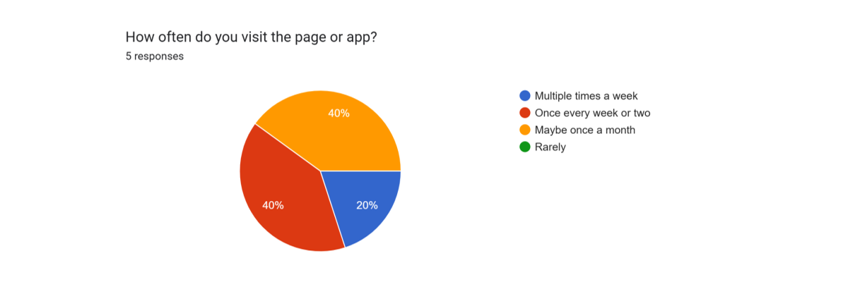
Survey participants were all regular users
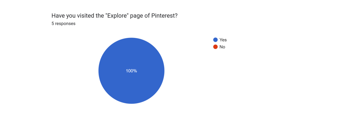
The percentage of people that use Pinterest have utilized the Explore page, showing demand
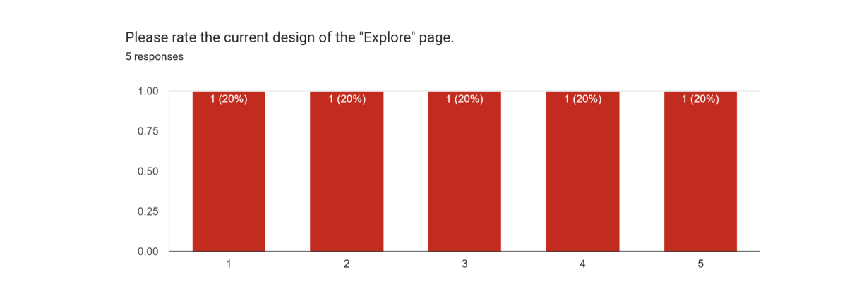
The opinion were very spilt, which indicates there is room for improvement of the design
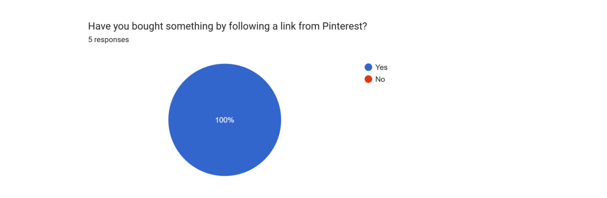
If all users have purchased through Pinterest, it shows that optimizing the shopping experience is a priority
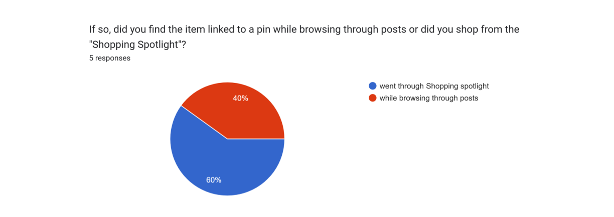
Survey found that more shopping traffic has gone through the Explore page than just normal browsing
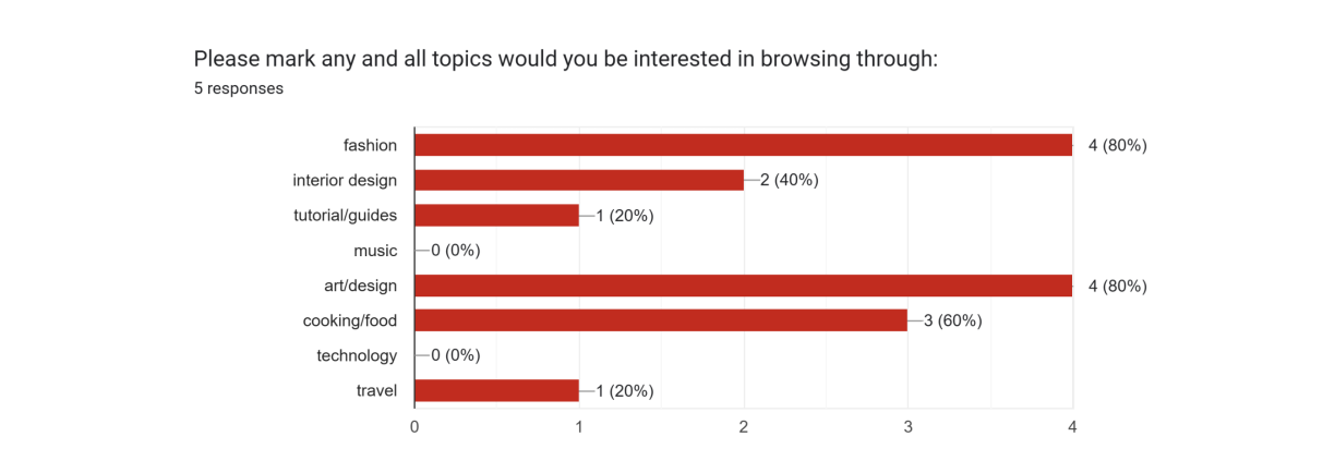
This poll was put out to gauge which categories could be a good addition as a section in the Explore page
The revisions

I saw a small problem in the execution of the design, but the layout had a solid foundation.
I kept the original categories and tweaked the UI. The one addition to the page was the trending tags. It was originally located in the dropdown of the search bar but it would get more interaction if it was out in the open.
For the visual design, I varied the size of the article links to break up the straight solid grid and more of a playful tile layout like the home page.
The shopping spotlight received a 4x4 tile instead of one picture to differentiate the section from the others. Another reason was to show more of what each shopping category included to attract more clicks.